Urban Landscape Photography Prints for Homes
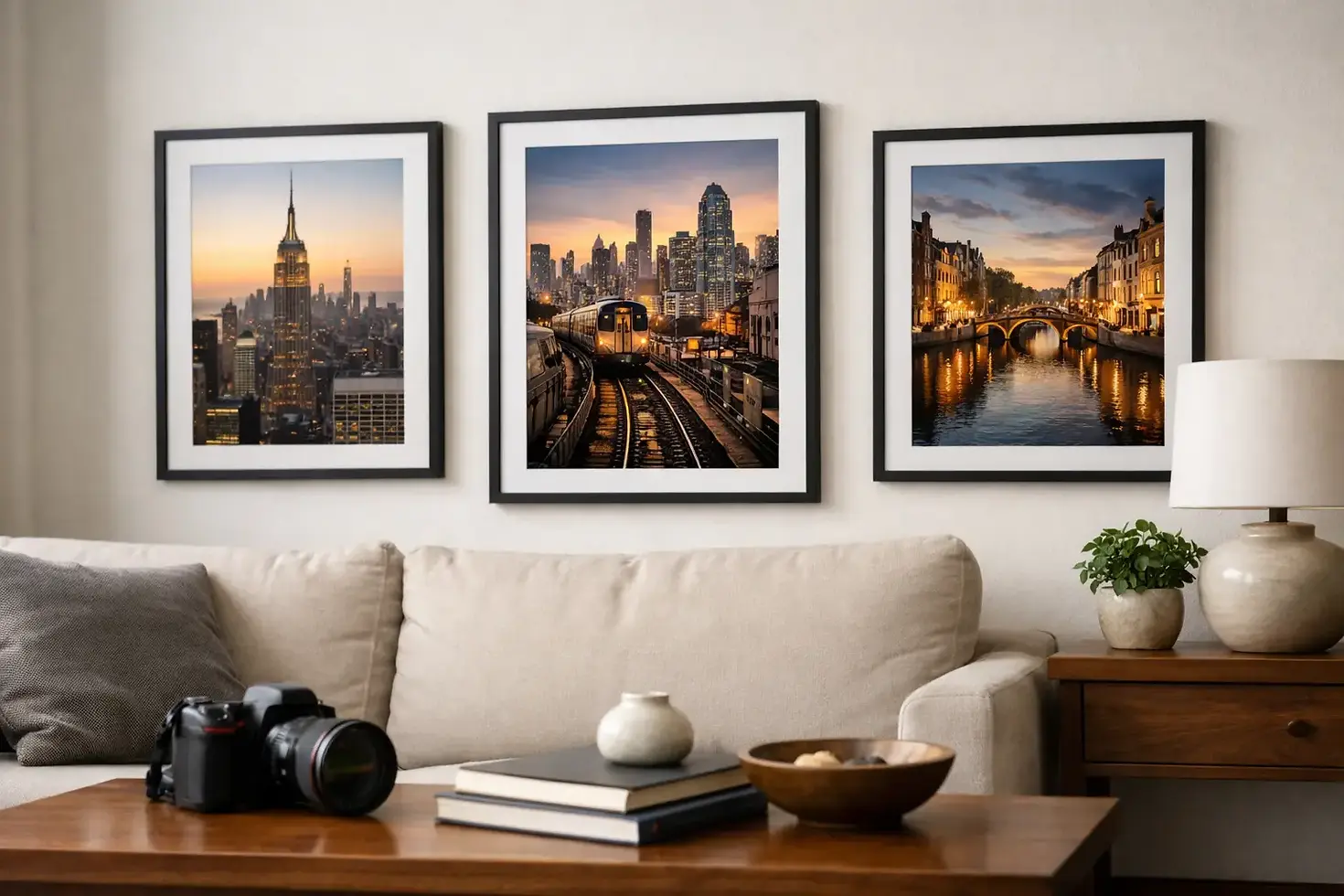
A room can have excellent millwork, tailored furnishings, and carefully chosen finishes yet still feel unfinished. Often, what is missing is not another decorative object but an image with enough presence to establish mood. Urban landscape photography prints bring structure, atmosphere, and a sense of place to interiors that need more than generic wall decor.
For homeowners, designers, and collectors, a city image can do more than document a skyline or familiar street. It can echo the geometry of a stair rail, deepen a restrained color palette, or give a large wall the visual authority needed to anchor an entire room. The strongest selections feel considered from across the room and rewarding up close.
Why Urban Imagery Changes an Interior
Urban scenes carry a visual language that works naturally with contemporary architecture. Lines, windows, bridges, steel, concrete, brick, reflections, and illuminated streets introduce order without making a room feel rigid. They can be polished and graphic, quiet and atmospheric, or richly layered with the evidence of daily city life.
This makes urban work especially useful in spaces where the architecture already has a point of view. A modern residence with clean planes may benefit from an image with bold perspective and precise geometry. A historic home with warm wood, textured plaster, or original masonry may call for a city scene that reveals age, weather, and material. The goal is not to make every element match. It is to create a conversation between the room and the artwork.
Unlike mass-produced decor, a fine art print also gives the space a specific point of view. It suggests that the owner chose an image for its composition, light, and emotional pull rather than simply filling an empty wall. That distinction is felt immediately in a thoughtfully designed home, hospitality setting, office, or shared commercial environment.
Choosing Urban Landscape Photography Prints by Mood
The right image begins with the feeling the room should hold. Before considering a particular city or landmark, look at the existing mood of the space. Is it composed and minimal? Warm and inviting? Dramatic after dark? A print should strengthen that intention rather than compete with it.
Black-and-white urban work is often a strong choice when the room relies on shape, texture, and contrast. It can bring visual discipline to a space with varied finishes, or give a neutral interior a focused focal point. It is particularly effective alongside stone, metal, charcoal upholstery, white walls, and architectural lighting.
Color work offers a different set of possibilities. A blue-hour skyline can cool a warm room and create an evening sense of calm. Golden light on brick or glass can connect beautifully with walnut, brass, leather, and earth-toned textiles. Rain-slick streets and reflected neon may bring energy to a loft, media room, or contemporary commercial space. Color does not need to match every accessory. It should relate to the room's dominant undertones and provide enough contrast to remain visible.
Scale matters as much as palette. A large print with a clear visual structure can make a high-ceilinged room feel intentional rather than sparse. In a narrower hallway or beside a doorway, a vertical composition may reinforce height and movement. Smaller pieces can be compelling in groups, but they need a shared visual relationship, such as a common city, tonal range, or architectural subject.
Let the Architecture Guide the Selection
A print should respond to the wall it occupies. This is especially true in custom homes and renovation projects, where art is one part of a larger architectural plan. Consider the viewing distance first. An image seen from fifteen feet away needs an immediate read: a strong skyline, bridge silhouette, intersection of lines, or illuminated facade. A print placed near seating can support more detail, allowing viewers to notice reflections, surface texture, and smaller moments within the frame.
Wall proportion is equally important. A wide horizontal scene can settle a long dining room wall or extend the visual rhythm above a low console. A tall city composition can bring balance to a two-story entry, a stair landing, or the area between windows. When working above furniture, the artwork should feel connected to the piece below it rather than floating alone. As a general visual rule, a print or arrangement often looks most balanced when it spans roughly two-thirds to three-quarters of the furniture width.
Framing should support the image and the room without distracting from either. A slim black frame gives graphic urban work a crisp, contemporary edge. Natural wood can soften a scene with concrete, glass, or industrial detail. Float mounting and clean white borders offer breathing room for images with dense compositions. In a formal setting, a more substantial frame may provide the presence needed to hold its own against detailed trim or richer finishes.
There is no single correct approach. A dramatic city print can deliberately contrast with a traditional room, while a quiet architectural study can bring restraint to a highly modern one. The key is choosing contrast with purpose.
Build a Collection, Not a Matching Set
For larger projects, several images can create continuity across rooms without repeating the same visual note. A foyer might introduce a bold urban panorama, followed by quieter details in adjacent spaces: patterned windows, a shadowed arcade, a bridge, or an abstracted reflection. The home feels connected, yet each room retains its own character.
Interior designers can use this approach to guide movement through a property. One image establishes the dominant palette, while related works repeat a color, direction of light, or material quality elsewhere. This is more sophisticated than selecting identical frames and hoping they create cohesion.
Collectors may also prefer a series built around a personal connection. That could be a city that shaped a career, a place visited often, or an architectural style that continues to hold their attention. The work gains value beyond decoration when it carries memory and observation. A print becomes part of how the owner tells the story of the space.
Quality Is Part of the Experience
An exceptional image can lose its impact when it is reproduced without careful attention to detail. Fine art urban landscape photography prints depend on tonal range, clean shadow detail, accurate color, and materials that preserve the intended character of the photograph. Dark scenes need depth without turning into featureless black. Bright windows, streetlights, and reflective surfaces need control so they retain their brilliance without overwhelming the composition.
Print size and substrate should be selected for both the image and the installation environment. A highly detailed cityscape may reward a larger presentation. A softer, more atmospheric scene may be especially effective on a material that supports subtle tonal transitions. Light exposure, wall color, and nearby fixtures all affect how the work is perceived throughout the day.
This is where professional guidance has practical value. Howard Hinton Jr. of Reminders Plus Photography brings award-winning technical precision and an artist's eye to work intended for gallery-ready presentation. For a homeowner or design professional, a direct conversation about dimensions, placement, and the character of the room can prevent an otherwise excellent piece from feeling undersized or disconnected.
Give the Image Room to Speak
Urban artwork does not need to shout to make an impact. A restrained scene of repeating facades, a lone street under changing weather, or a precise study of light across a building can hold attention because it leaves room for interpretation. The best choice is often the print that continues to reveal something after the first look.
Choose the image that makes the architecture around it feel more deliberate, the room more personal, and the people who enter it more inclined to pause. That is when a wall becomes part of the experience of the home.


Comments